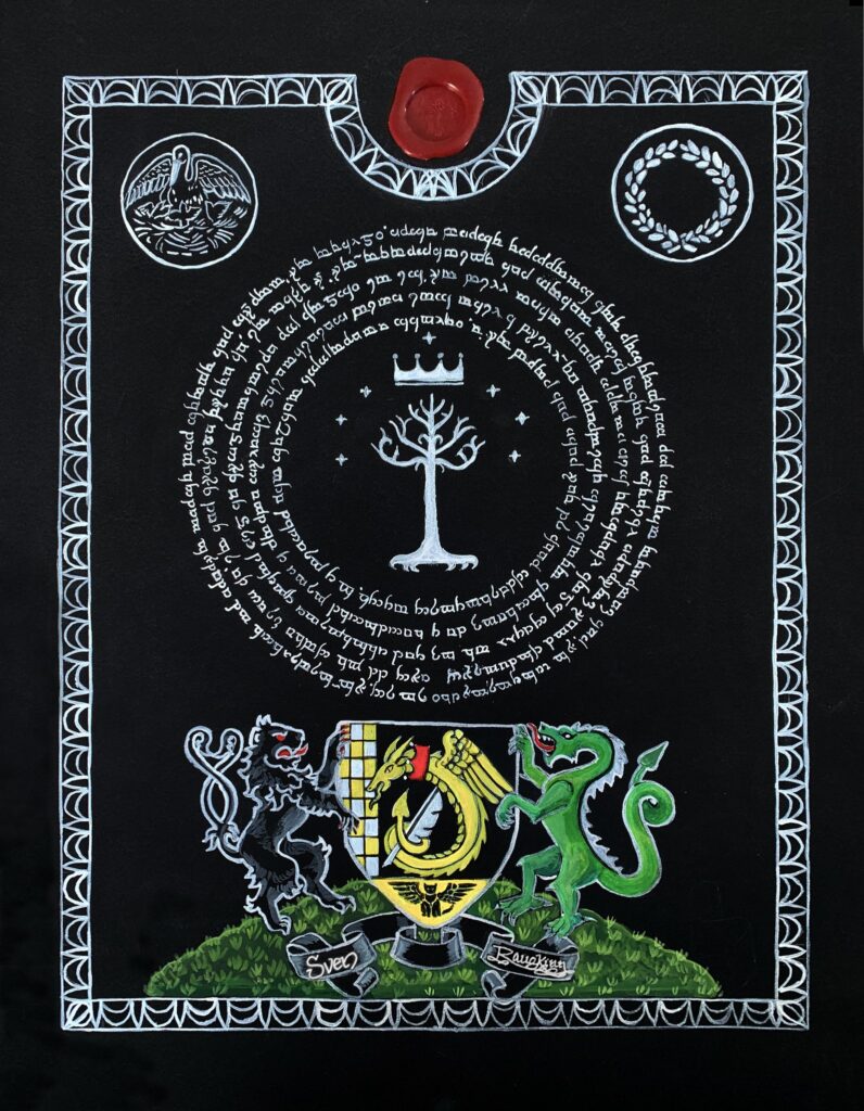
This year I was given the opportunity to create two Augmentation of Arms scrolls for worthy recipients.
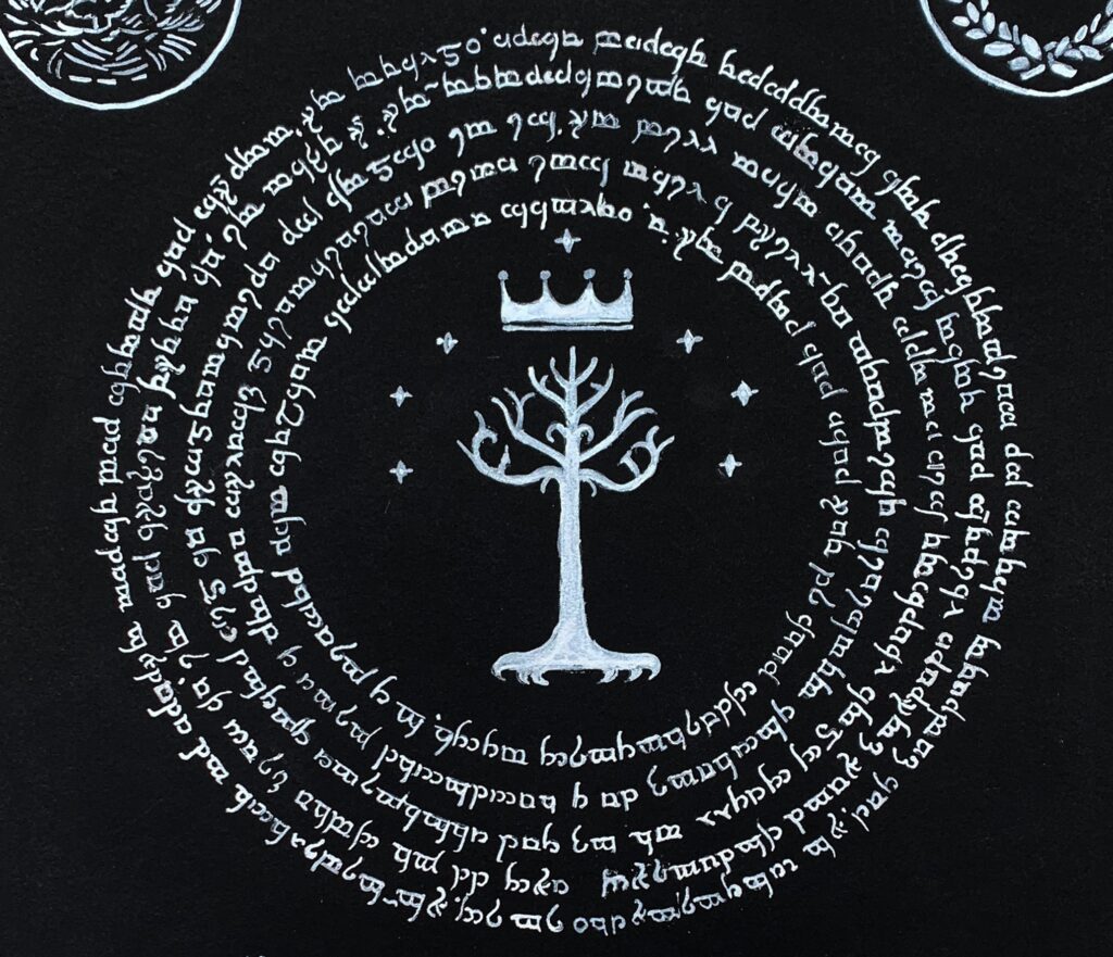
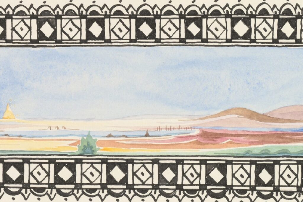
The first was a very custom piece for a recipient who had been in the SCA for decades and was known to be a huge Tolkien fan. After a series of discussions with the Royal scribe regarding Tolkien-ish compents the recipient would appreciate, I settled on an idea based on a mix of the art on the Mines of Moria, The Tree of Gondor and some sketches Tolkein himself created.
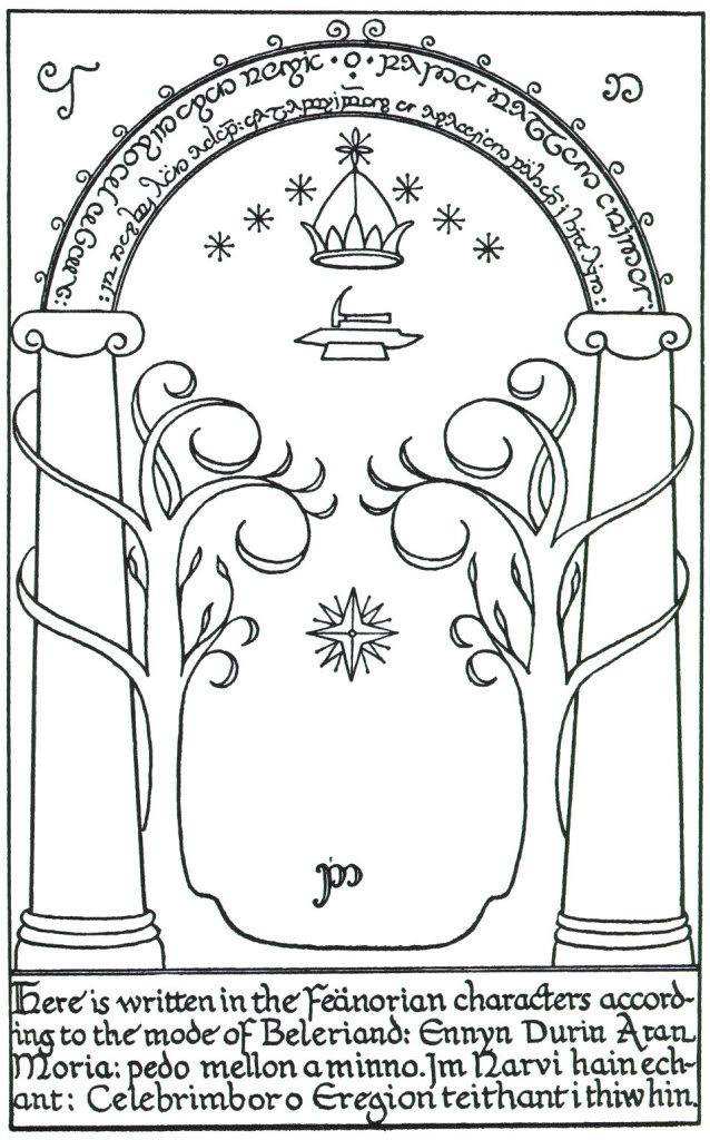
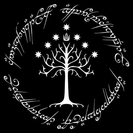
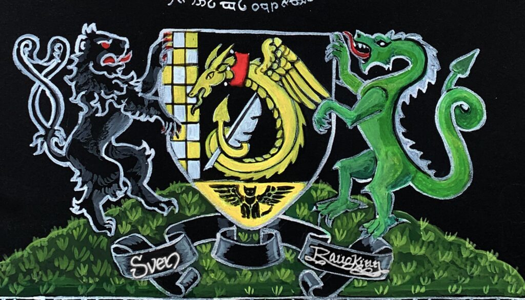
Since this was an Augmentation of Arms, I also included two beast supporters and the recipient’s augmented registered arms.
My vision for this piece was of the words and design glowing out of the darkness, such as when the fellowship reach the doors of moria and behold them in moonlight. Since the recipient is both a laurel and a pelican, those two symbols are provided in the border. And the border design was taken from one of Tolkein’s sketches.
There were four tricky parts to this artwork.
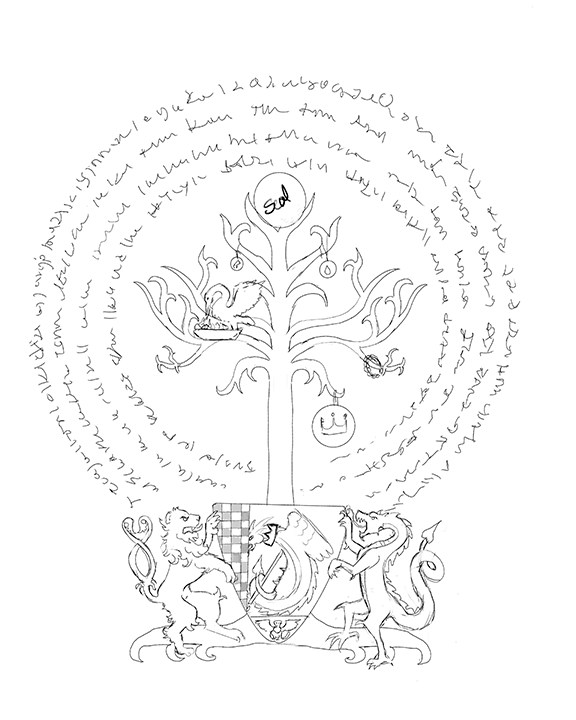
- Layout on black. Since the paper I used is a thick black Arches paper, it will not work with a lightboard. To layout the art I taped a piece of light colored transfer paper under the design and traced the artwork.
- Adding color – black rag paper sucks up ink and paint, especially water based. To combat this I first had to cover in layers of white any area that was going to be painted in color. In this case I used white acrylic as I wanted it to be permanent and not blend with the colors I painted on top of it (I could have used a ‘fixative’ such as egg, with gouche, but I went with a more modern solution for expediecy and archival purposes).
- The elvish words. I wanted a seamless appearance that didn’t have an obvious start and end and it spaced perfectly. I also do not speak or write elvish. There were several ways I could have accomplished it – I could have written out the text by hand, counted the characters, used a ruler to map out spacing and sizing and mocked it up on paper. But instead I used Photoshop, since I am a digital artist as well as a traditional one. I researched elvish fonts until I found one that is generally considered “mostly accurate” (none were considered entirely accurate). I sized out the space in Photoshop, created circles and added the text in the elvish font. Then I fiddled with the kerning until I achieved a series of smooth circles. This I printed and traced on my final piece.
- The silver ink. Most of this art is in silver ink. I have a few variety I could have used, but settled on a thick acrylic ink which I applied with a calligraphy pen. I had to do 2-3 layers in order to get it bright enough to see.
